Part of the Home Dash series at Château KavSmith. Start with the story if you haven't. Last updated 19 November 2026.
The first version of Home Dash took a day. What's taken the time since is the hundred small "should it look like this, or like that?" questions. I got tired of answering each one from scratch, so the dashboard has rules now, written down, and most questions answer themselves.
The look that started all this is Pinesdash. These rules are what I took from studying it, plus what our house taught me.
1. Lit means active
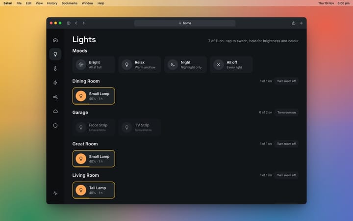
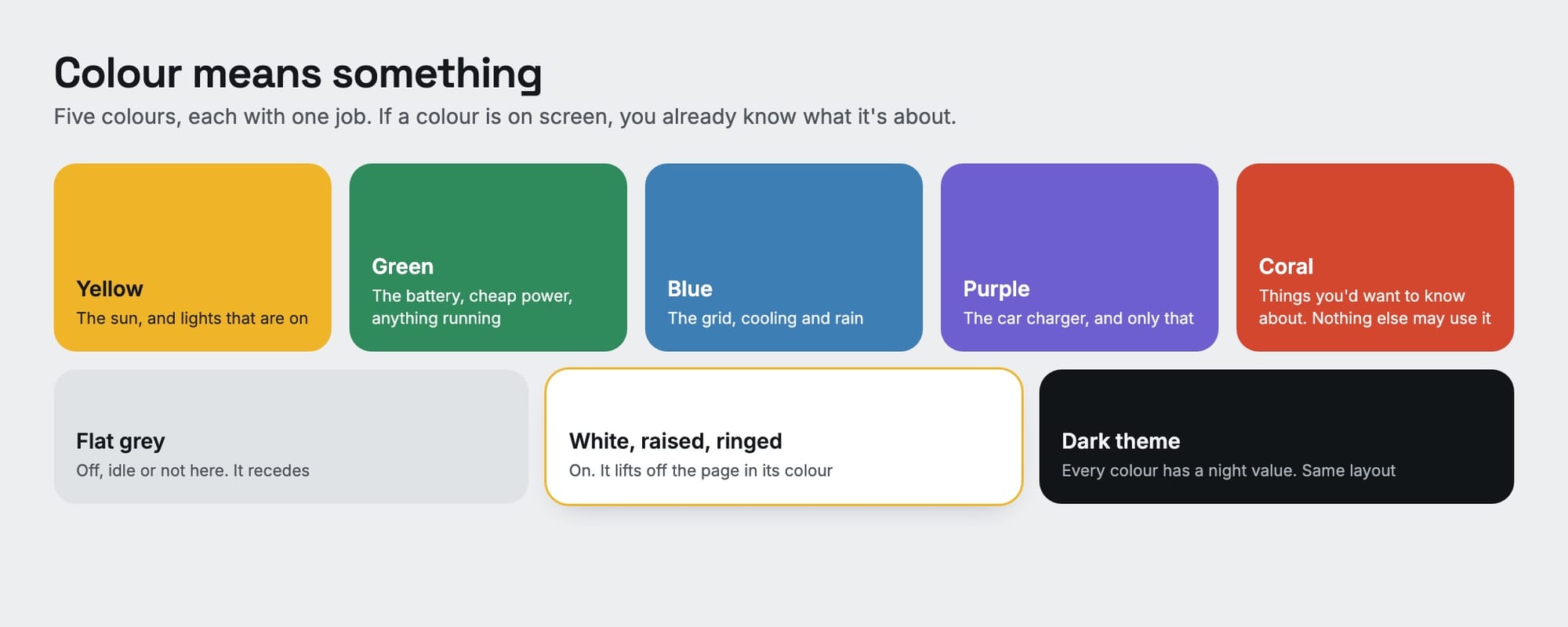
If something is off, its tile is flat and grey with no shadow. If it's on, the tile turns white, lifts off the page and gets a ring in its colour. That's the whole trick, and it means you can read the house from the other side of the room without reading a word.

2. Colour means something
There are five colours and each has one job. Coral is the strict one: it's reserved for things I'd actually want to know about, and nothing else is allowed to borrow it. The moment a colour is used for decoration, it stops telling you anything.
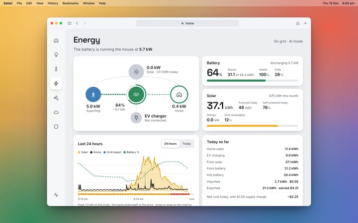
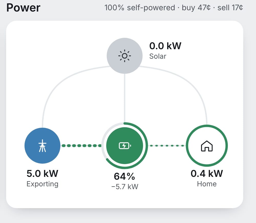
The power flow is where it pays off. The dots take the colour of where the power is coming from, so this one reads at a glance: no sun, the battery is running the house and selling the rest.
3. Numbers first
One big number per card, a small unit beside it, and one plain sentence underneath. "20.8°. 61% humidity, air good." If I need a second big number, it's a second card.
4. Quiet unless it matters
The top right corner of the home screen is empty most of the day, on purpose. A pill only appears when there's a reason: a weather warning, or power that's properly cheap or properly expensive. Things that are worth knowing soon but not now get even less: one small line under the date.

5. Look, don't steer
The battery and the car charger run themselves, and they're better at it than I am. So the dashboard shows what they're doing and has no buttons for them. Only lights and speakers are controls. A screen that can't break anything is a screen the whole family will use.
6. Instant, then honest
A tap shows its result straight away, and if the device never answers, the screen takes it back and says so. Fast, but it doesn't lie to you. There's a diagram of how that works in what's running it.
Four times I changed my mind
Rules are easy to write. These are the ones real life wrote for me.
"Cheap" at 38 cents. The dashboard kept showing a green "cheap" pill at prices that weren't. It was passing on Amber's label, and Amber calls the price low most of the time. Now the lines are mine: green at 15 cents or less, red at 40 or more. The rule: the dashboard decides what's worth saying, not the data source.
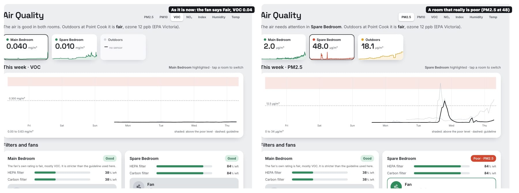
The fan that cried wolf. One morning the whole Air section lit up as "fair". The air was fine. A purifier fan had taken offence at some deodorant, at a level about a seventh of the health guideline. Now rooms are rated against the guideline drawn on the chart, and the fan's opinion is one line of small print.
The football, four months early. I added a tile for the footy. It worked perfectly, and in November it was proudly telling me about a game in March. Now it shows from a week before a game to two days after.
The bin that wouldn't leave. Same lesson, a day later. Bin night sat under the date all week, which made it wallpaper. Now it appears two days out, goes bold the night before, and vanishes at midday on collection day.
Those last two became a rule of their own: if it isn't relevant yet, it isn't on the screen.
The boring part that makes it work
All of this is written down as a small design system: the colours and what each is for, two typefaces (Space Grotesk for the big numbers, Inter for everything else), a handful of spacings and corner sizes, and a page of rules like the ones above. It's not there to look professional. It's there so that when I add a heat pump next month, I don't have to decide what a heat pump looks like. The rules already know.